Novartis
Transforming internal document search with enhanced usability
Novartis' internal document search platform, DMS DocFinder, was being discontinued due to technical limitations. The company needed a new, user-friendly solution to streamline document access for employees across departments, especially for SOPs (Standard Operating Procedures).
As the Senior Product Designer, I led the entire research and product design initiative, engaging with stakeholders, facilitating workshops, and ensuring alignment between user needs and technical feasibility. The goal was to deliver a new SOP document search platform that significantly improved document retrieval for Novartis employees.
Role
Senior Product Designer
Led the design process, from research through to implementation. Conducted user interviews, facilitated workshops, and developed prototypes. Worked closely with stakeholders and the development team.
Team
Luca Fiorentini — UX Designer
Aleksandar Cojic — Design Lead
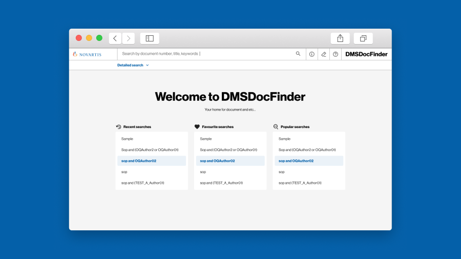
Simplifying a complex legacy system for modern users
This project aimed to replace Novartis' outdated document search platform, which had been decommissioned due to technical limitations. A Proof of Concept (POC) had already been developed by the technical team as an initial exploration, and it served as a foundation for our design efforts.
However, the POC highlighted some challenges that needed to be addressed in the final solution:
- Discontinued system: The previous document search platform was technologically outdated and no longer sustainable.
- Complex search functionality: Users were unsatisfied with the search system, finding it difficult to switch between different methods, like full-text search and filters.
- Hidden features: Essential functions, such as exporting results and saving searches, were buried in menus, reducing efficiency.
The solution was required to be modern, intuitive, and scalable, aligning with Novartis' long-term technical capabilities while addressing these user pain points.
Uncovering hidden pain points through research
To ensure the new SOP document search platform addressed both user expectations and technical constraints, I led an in-depth research process divided into two key phases:
Expert usability review
We began with an expert usability review based on Jakob Nielsen’s 10 Usability Heuristics to identify major pain points in the existing system. This review helped highlight issues with navigation, visibility of system status, and inefficient feedback mechanisms.
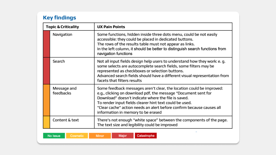
Key findings from the expert usability review
User interviews and usability testing
I conducted 17 in-depth user interviews and led usability tests. These sessions were based on the existing Proof of Concept (PoC) and users' daily activities on the platform. Each session lasted approximately 75 minutes, and we gathered both qualitative and quantitative data.
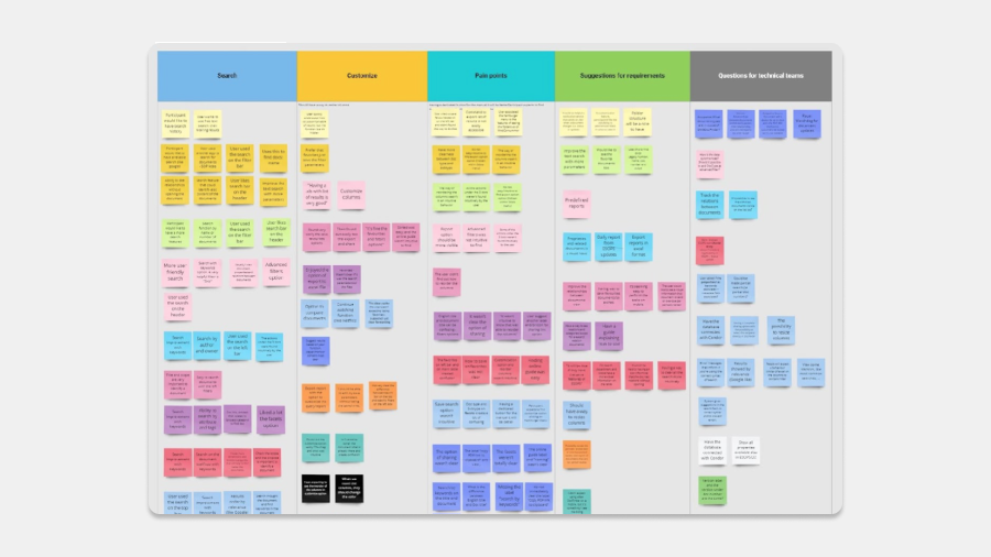
Interviews affinity mapping
Key insights included:
- Search inconsistencies: Over half of the users struggled with distinguishing between search modes.
- Hidden features: Essential functions like "Save to favorites" and "Export" were buried in menus, causing frustration.
- Customization needs: Users expressed a desire for greater control over how search results were displayed, including options to reorder columns and save custom views.
This phase of research ensured that the final solution would be data-driven and human-centered, addressing specific pain points uncovered during testing.
Design process: Turning user's pain points into a seamless experience
Stakeholder engagement and workshops
To ensure alignment between user needs, technical constraints, and business objectives, I facilitated multiple cross-functional workshops. These sessions brought together stakeholders from product, development, and end-user teams to gather feedback, validate early concepts, and ensure that all teams were in sync throughout the design process.
Wireframing and Prototyping
We began with low-fidelity wireframes, prioritizing a user-friendly interface that made essential features more accessible and intuitive.
Key improvements included:
- Simplified search flow: Improved clarity in switching between full-text, filters, and facets.
- Visible key features: Essential functions like "Save to favorites" and "Export" were moved from hidden menus to easily accessible locations.
- Customizable results: Users could reorder columns and save custom views to make search results more manageable.
Once these wireframes were validated, we transitioned to interactive prototypes using Figma, which allowed for more dynamic user interactions and iterative feedback collection.
Usability testing and continuous improvement
Usability testing was a continuous, iterative process. Through multiple testing rounds, we gathered actionable feedback that directly informed design improvements. For instance, when users indicated that the advanced search panel was too visually prominent, we adjusted its placement to reduce clutter without sacrificing its utility.
Each iteration focused on enhancing usability while balancing the platform’s functionality and technical requirements.
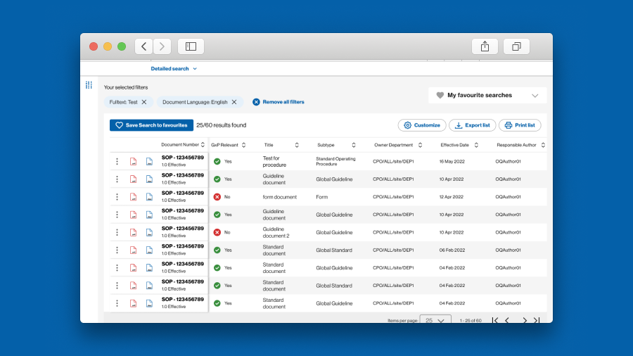
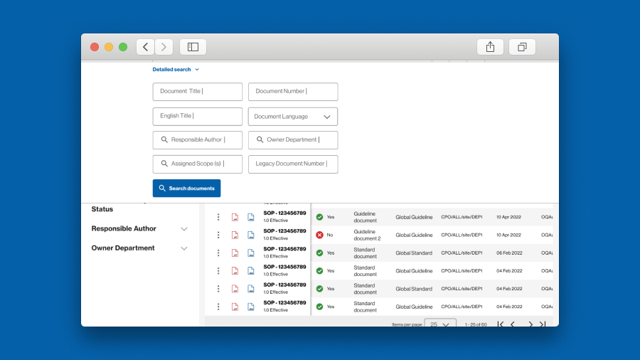
Transforming document search into an intuitive process
The final solution successfully addressed the main challenges uncovered through research, providing an intuitive, scalable platform aligned with Novartis’ technical capabilities.
Key elements of the solution included:
- Streamlined search experience with clearer navigation between search types;
- Essential functions like Export and Save to favourites made more accessible;
- Enhanced result customization, allowing users to modify and reorder columns;
- Improved feedback messages for better user guidance;
Outcomes and Impact
The revamped platform delivered measurable improvements in both usability and user satisfaction. Post-launch feedback and metrics highlighted the success of the design:
- 40% improvement in task success rate;
- 30% increase in user satisfaction scores;
- 50% reduction in support requests;